Make eligibility visible
The program panel and checklist help guests evaluate fit before starting.

Helping guests understand Rewards Match, compare casino offers, and find their next step.
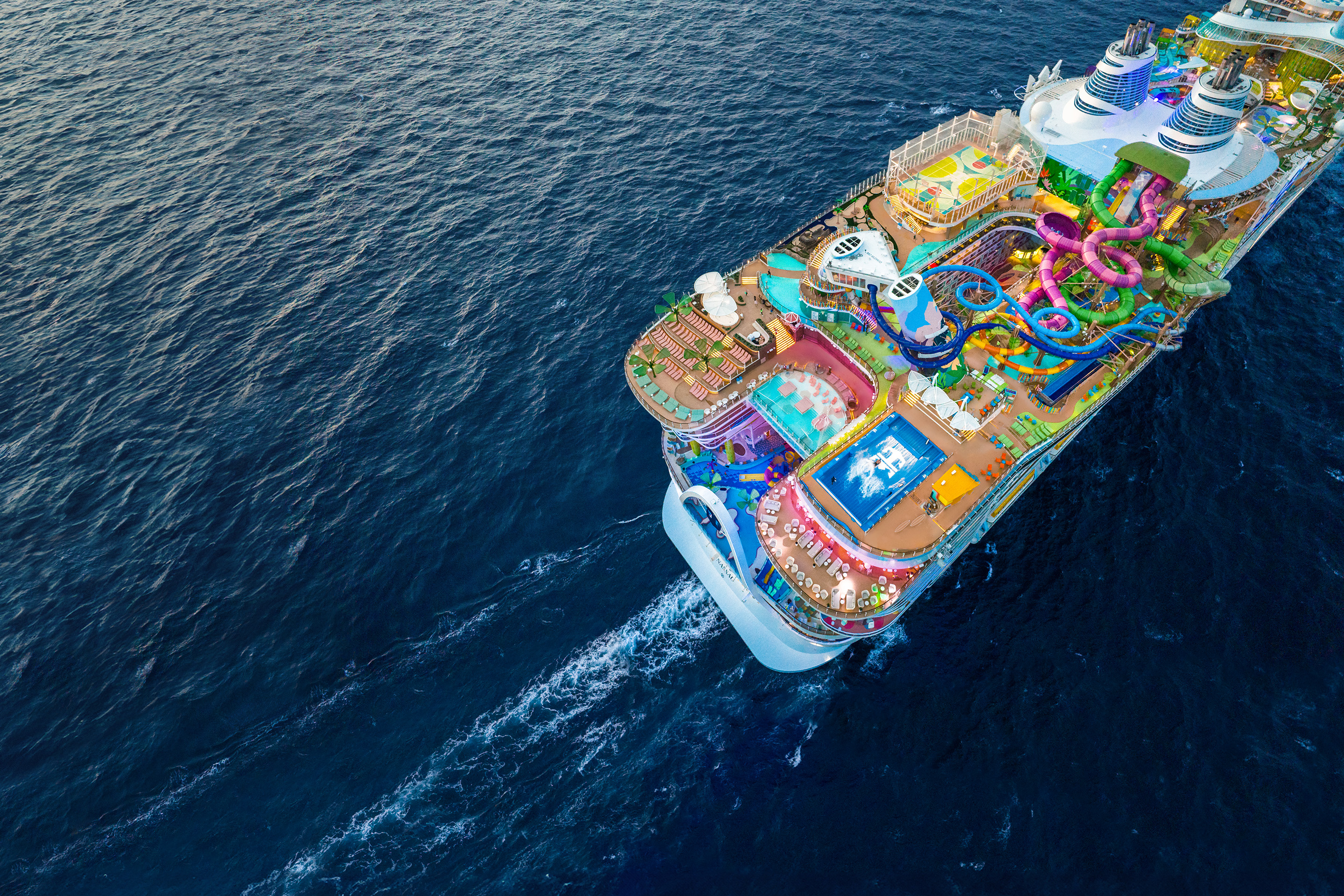
Royal Caribbean Group’s casino loyalty experiences connect guests with membership benefits and cruise offers. Guests come to these digital tools to find their available offers, understand what is included, and explore how to use them.
As a UX/UI Designer on the Casino team, I worked across Royal Caribbean’s Club Royale and Celebrity’s Blue Chip Club. My scope included Rewards Match entry pages, offer cards, responsive layouts, and consistency across web and mobile.
Guests needed to understand eligibility before starting an application, then distinguish an offer’s benefits, restrictions, and next action. My focus was to make those decisions clearer across brands and screen sizes.
Rewards Match introduces qualifying land-based casino members to a matched cruise offer. I developed an educational entry-page direction that brings the program value, eligibility checks, and required information ahead of the application.
This gives guests a chance to assess the program before investing effort. Separate account-creation and sign-in paths also support both new and returning guests.
Shared information architecture, adapted to each brand’s visual language. Select a screen to explore it at full size.
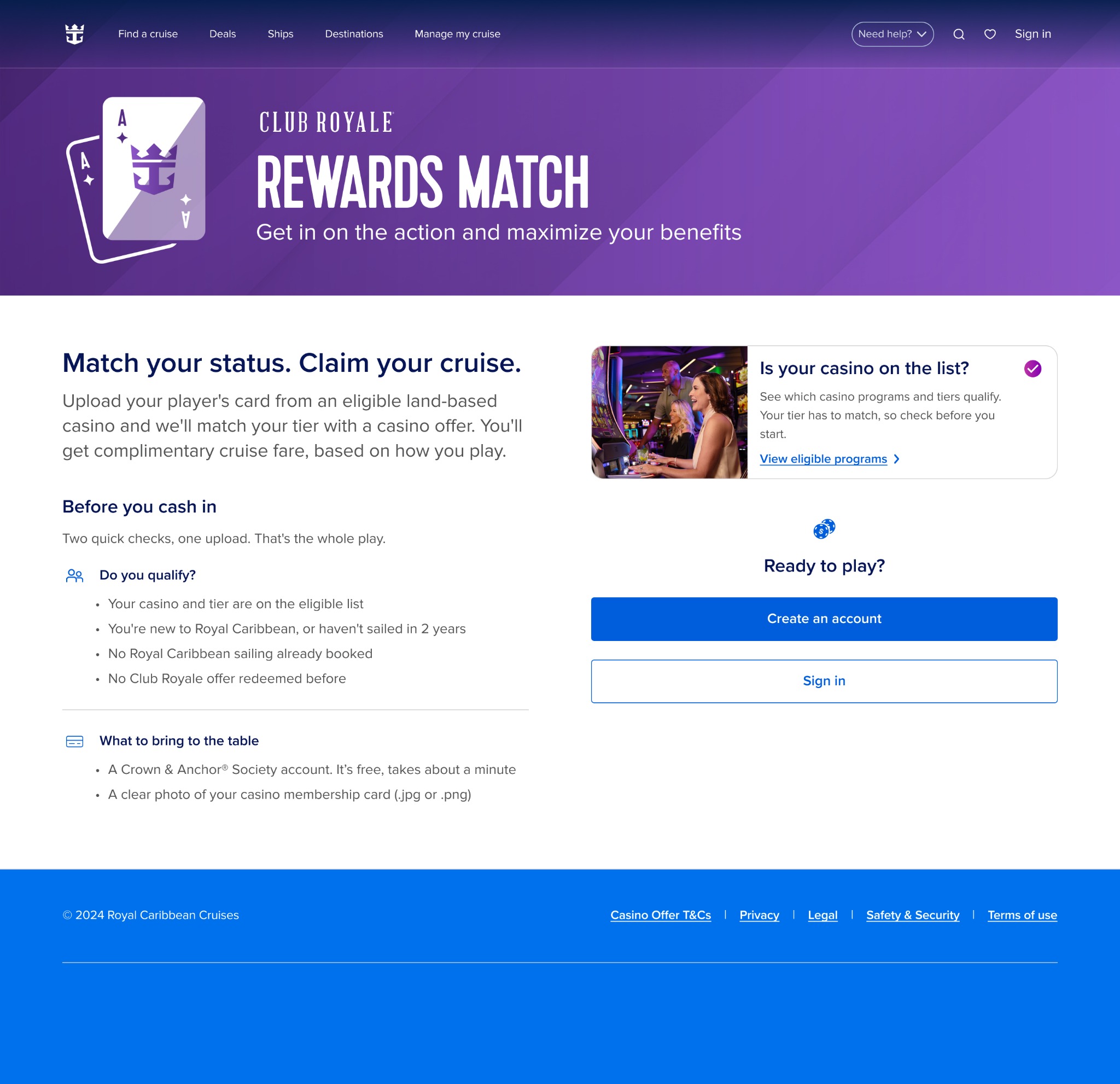

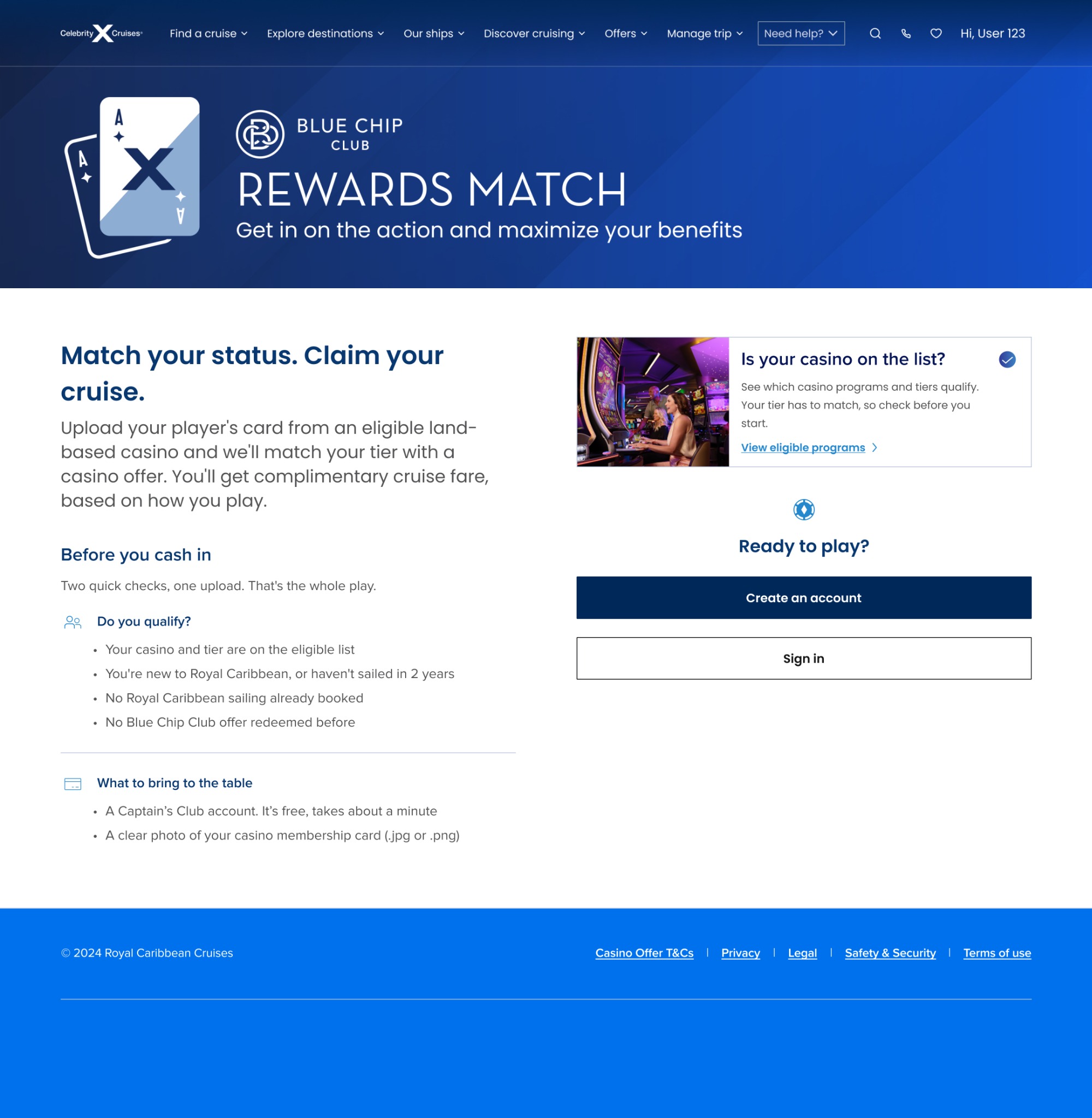
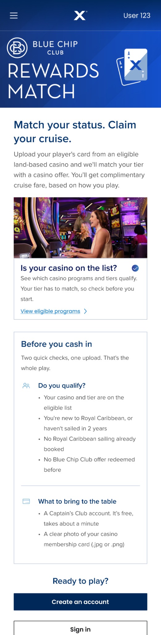
The program panel and checklist help guests evaluate fit before starting.
The preparation section explains which account and membership information to have ready.
Distinct account-creation and sign-in actions support different starting points.
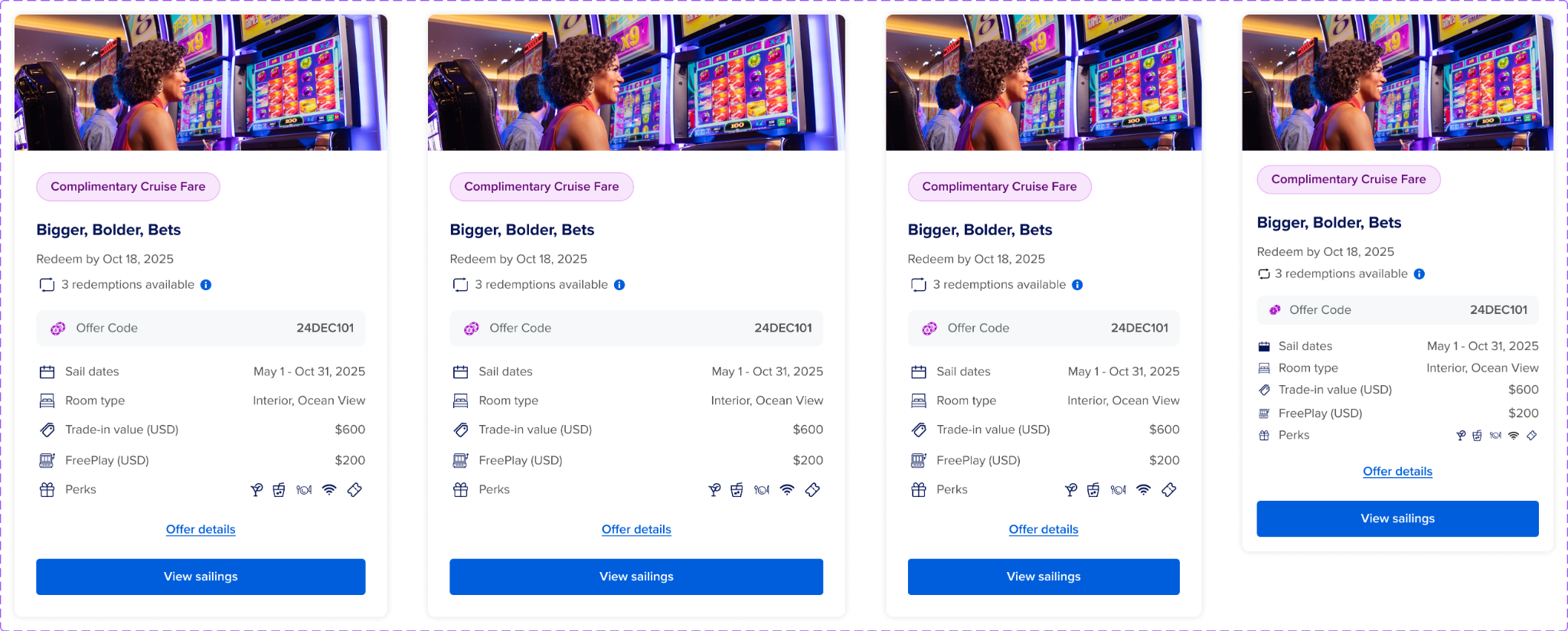
I refined the hierarchy of offer type, redemption availability, travel dates, and benefits. A guest should be able to scan the offer, check the details, and recognize the next step.
In this design, “Offer details” is the supporting path and “View sailings” is the primary action. The annotation below shows how the card separates those decisions.
Select a note to highlight its position on the card. The numbers connect the screen to the explanation.
Selected offer-card design with the key hierarchy and interaction decisions annotated.
I reviewed card spacing, text wrapping, imagery, and action hierarchy across four layouts. The offer information keeps its reading order while the available space changes.
I partnered with design, product, engineering, mobile, marketing, and content teams to resolve cross-brand and responsive requirements. My work included Figma specifications, handoff annotations, filter alignment, and Casino Hub explorations around member status and benefits.
The conversion goal was to help eligible guests move from interest into the application, and from offer discovery toward sailing selection. My contribution focused on the decisions along that path.
Explain value and requirements so guests can continue with clearer expectations.
Make benefits, timing, and availability easier to compare.
Give sailing selection a clear primary action, with offer details available alongside it.
These are the conversion-focused design contributions. A measured post-launch conversion lift is not claimed.